Where Walls Float and Hearts Are Garbage: FELIX BURRICHTER’s BLOW UP
Part 1960s Antonioni, part Ibsen tragedy, and part sex-doll dreamscape, “Blow Up,” a recent exhibition at New York’s Friedman Benda curated by Felix Burrichter, is an exercise in “the aesthetics and materiality of scale, and how the objects we’re surrounded with during our childhood condition our ideas of domesticity, taste, and social norms today.” Marcella Zimmermann considers Burrichter’s Freudian trip through a 1:1 dollhouse, shot by Lyndsy Welgos.
Felix Burrichter inherited his sister’s dollhouse when he was four years old. It was 1982 and little boys weren’t supposed to play with dolls, but the hand-me-down toy inspired a lifelong fascination with spatial identity – what is this room for? Why is it done like this? Why does it make me feel this way? And what does it do for you?
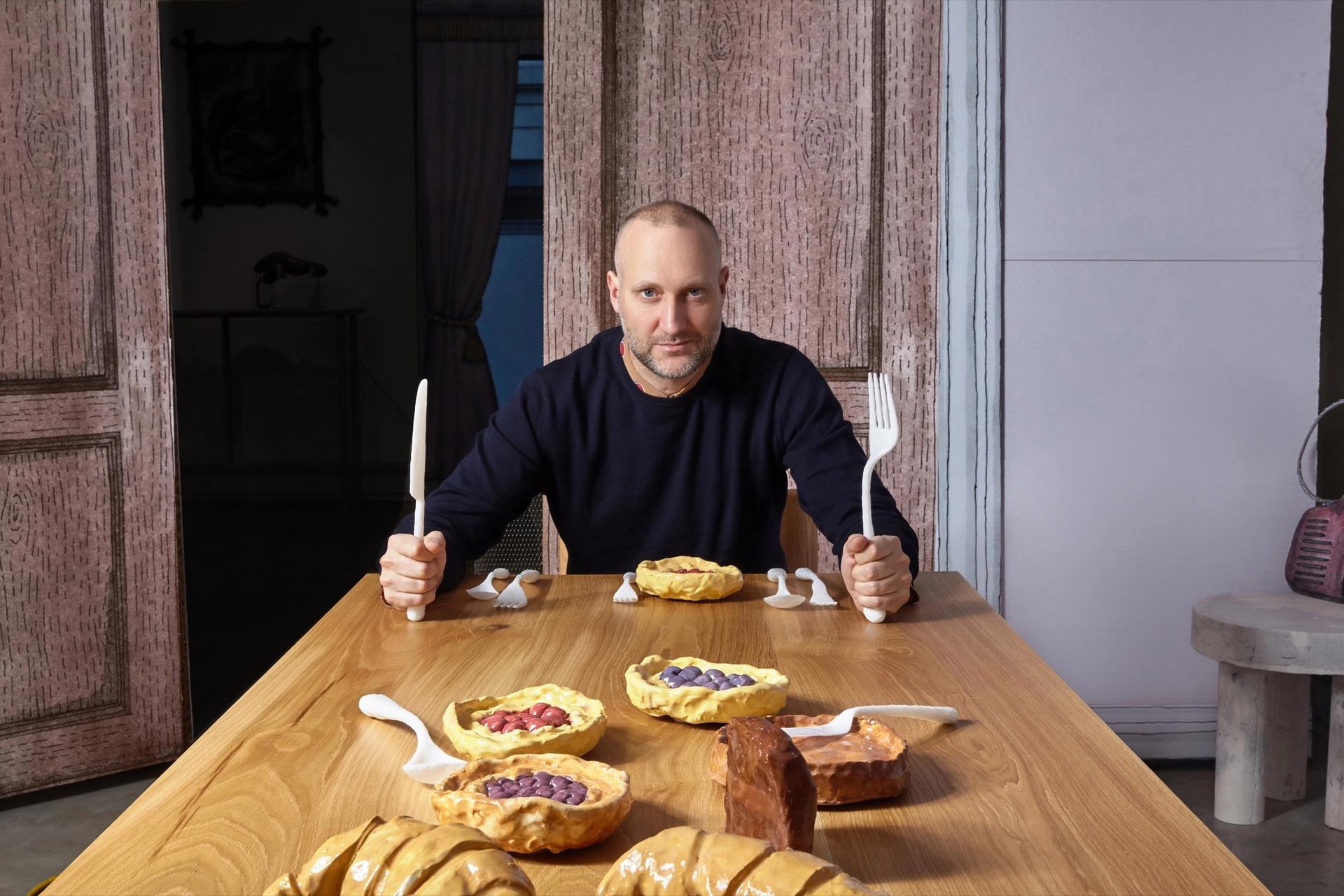
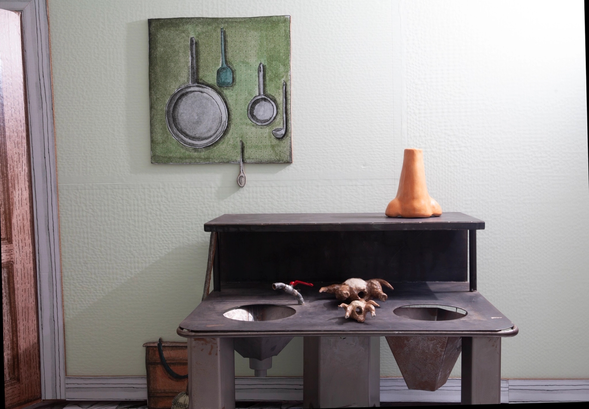
A few decades later, Felix is now an editor and curator of ‘architectural entertainment,’ the clever tagline for his magazine, PIN-UP. In “Blow Up,” a group show he curated at the New York art and design gallery Friedman Benda, Burrichter reimagines his traditional childhood dollhouse as the life-size home of a wealthy and strange gay intellectual. In this macabre dream world, walls float, hearts are garbage, cribs spin, and there are toilets in the dining room. Though odd, the mish-mash of curious objects evokes a powerful sense of nostalgia for a place or time that never existed. The pink comforter in the bedroom makes me ache for happy adolescence; the kitchen reminds me of home-cooked meals I never tasted.
Throughout the exhibition, which was designed by Adam Charlap Hyman (of Charlap Hyman & Herrero), Burrichter places works by the new guard of the Hip-Ugly, including Katie Stout, Misha Kahn, and Telfar Clemens, alongside masterpieces by the original gangsters of the genre: Gaetano Pesce, Camille Henrot, and Shiro Kuramata. Each room of the house looks normal at first, but when examined, the dangly paper architecture gives way to boozy dark humor and a dizzying sense of instability. As a whole, the exhibition could be a sardonic set design: one-part Museum of Ice Cream and one part hell – a beautiful hell for only the witty, self-deprecating misfits to enjoy. I did.

