Not Too Twee: That is the answer. DUSHKO PETROVICH's “The Daily Gentrifier”
A print magazine isn’t simply a conduit for concepts, but a conceptual media in its own right. The format is structured by conventions and carries connotations that are opportune for creative rethinking as much as they sometimes feel like a burden. Or at least that’s something we think about a lot in our own work as publishers – though when we look around at the landscape of print media we inhabit, it often feels saturated with the same predictable moves and gestures. Similarly, working in the creative industry in Berlin, conversations around urban development, gentrification, and personal culpability feel at once urgent, inescapable, and often disappointingly dialed-in.
Created by DUSHKO PETROVICH, a Quito-born, Chicago-based artist, writer, and editor, The Daily Gentrifier brilliantly navigates both topical minefields. Treating tropes of publishing as if print were a sculptural media, the tabloid is fashioned into projectiles of probing analyses of gentrification. They don’t deflect responsibility, but also aren’t derailed by the guilty hand-wringing or accusatory finger-pointing that often seems to dominate the discourse surrounding displacement, rent increase, and artist responsibility. The Daily Gentrifier is not the first such project by Petrovich, whose imprint DME previously published Adjunct Commuter Weekly, an edition styled after the free newsprint dailies people pick up (and then abandon) on their train commutes, and that offered sharp critical commentary on American academia and its hypocrisies. Humor and wit, as much as print itself, are the platforms on which Petrovich shares, nuances, and dislodges the sticky ideas and rhetoric that encumber our discussion of privilege and professionalism, creativity, and criticism itself.
“If you’re paying attention, you see the people who are being pushed out of whatever neighborhood you got pushed towards. As with most social problems, you start out noticing it, and you end up trying to ignore it.”
How do projects like The Daily Gentrifier fit into your practice at large?
You could say it’s the art side of my publishing practice or the publishing side of my art practice, but the main thing is it’s where everything comes together. With my imprint DME, which puts out The Daily Gentrifier and previously made Adjunct Commuter Weekly, I get to edit, publish, design, write, make videos – all of it. There is even a play-acting aspect to the projects because I take on the role, theatrically, of editor of each publication. The editor of Adjunct Commuter Weekly has a certain persona and the editor of The Daily Gentrifier has another one, and so on. Privacy Magazine, for example, has a spokesperson, because I don’t speak about it publicly.
Can you talk about the large format chosen? Is the scale a nod to absurdism, and is this in turn a way of suggesting that there is an absurdity to the conversation about gentrification?
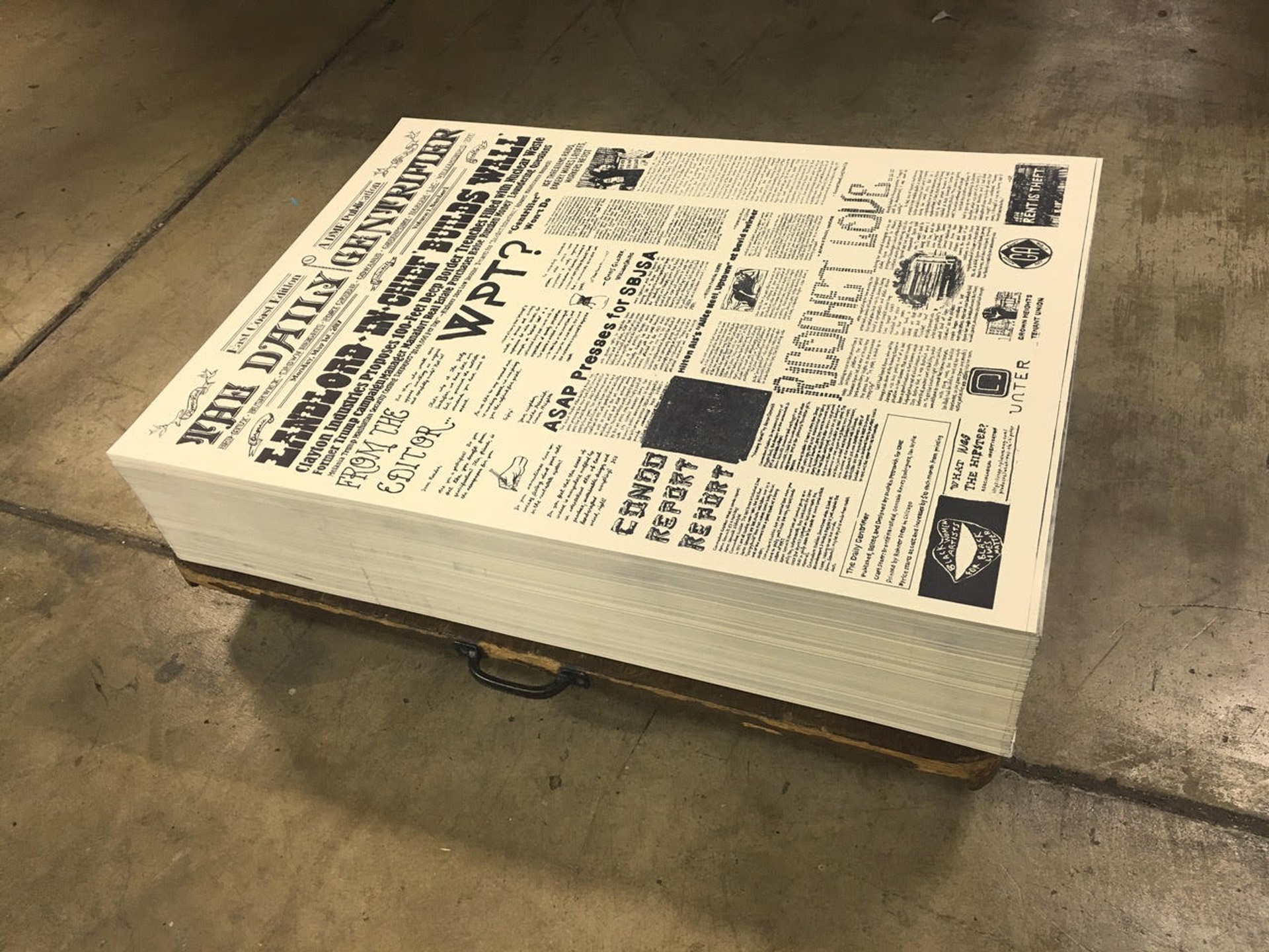
I wanted to make something conspicuous, yes, and awkward. The format is the 20” by 33” – historical broadsheet size – because I wanted to reference the history of newspapers in the 19th century, when they would be posted up in public, often in frontier situations. One of my irritations with the aesthetics of gentrification is that all this old, crafty, vintage, “historical” stuff gets used anti-historically, to cover-up the actual history. So the tactic with this project is to use those fonts, use the letterpress, use the old-timey format to actually speak frankly about what is going on when neighborhoods get gentrified. To really draw a line to the historical settler colonial aesthetics that are constantly being referenced in gentrification.
How do you experience the inevitable tension between being an enabler of gentrification – the “sense of unease” you mention in your editor’s note – and someone directly impacted by it? How do you perceive the psychological impact of these phenomena on art and creative workers in particular?
Like most artists, I spent years rent-surfing from neighborhood to neighborhood, trying to figure out how to afford an apartment and a place to make my work. And of course, if you’re paying attention, you see the people who are being pushed out of whatever neighborhood you got pushed towards. As with most social problems, you start out noticing it, and you end up trying to ignore it. Because you don’t know what you can do about it, and because you have to get on with the day-to-day. But the feeling that you are part of something destructive and cruel is still there, as a kind of emotional blockage. So my idea was to offer an admittedly minor incentive for people to speak up. And it turns out that a lot of artists and writers are sitting on projects, poems, novellas, and op-eds that address these issues, because everyone is going through it and everyone is noticing things in their own way. I’m basically trying to surface some of that.
Has anyone been deeply offended by The Daily Gentrifier? Your other projects? In general, have you noted any surprising (or conversely, consistent) responses?
Some of my contributors were pretty nervous about participating when I first approached them, worried that that they would be part of some bearded-dude irony brigade. But when people actually read the pieces, these anxious feelings subside. This one adjunct publication was mad that I said Adjunct Commuter Weekly was the “first lifestyle magazine devoted to an increasingly influential demographic,” because they had been publishing for years. But then I just underlined “lifestyle magazine” and I think they got the joke and saw why it was good to use (dark) humor to bring people to the point where they could discuss the topic more seriously. But it is risky, because housing and employment are deadly serious issues. I’m not trying to make them funny, I’m just trying to use the humor as a way into some of the complexities involved.
Are you ever surprised by what you uncover in the communities or through the individuals you are looking at and working with?
I have been pleasantly surprised about how, once you start asking around, a lot of people have projects in progress already. I initially thought I would have to commission things and tease them out, which I sometimes do, but a remarkable number of people are sitting on wonderful work about gentrification. When I made the Columbus Flyover Flyer, for example, people told me the poet James Payne was working on a novella about gentrification in Columbus. A novella! And it turned out to be wonderful, so I published an excerpt as the “Literary Supplement” to that Flyer, and James and I have been talking about how to publish the whole book. Similarly, I was on a panel with the brilliant legal activist and scholar K-Sue Park and she was like, “I have this op-ed on hipster gentrification aesthetics, do you want it?” And it was this pitch-perfect takedown that no one had wanted to print before me, so that was great.
“People often just pillory the hipster aesthetic, as if the beards and suspenders were the actual problem.”
Are you a fatalist? An optimist? A pessimist? An -ist of any kind?
I can’t really think of myself in those terms because I’m so moody. I’m mostly a pragmatist in that I try to identify a shared problem and then I work to address it in whatever crazy way I can.
Can you talk about the title, your use of journalistic tropes in general in your work?
Working in journalism, I notice the areas that journalism avoids and then I try to work there. With the DME projects in particular, I redeploy some of the techniques and styles of journalism to begin to address these areas of avoidance but also to underline to the initial avoidance of the topic. So I use actual journalistic methods (research, interviews, fact-checking, etc), but the journalistic tropes (the headlines, the corny titles, the ads) are there to pin the whole thing to journalism as it’s currently practiced. So the underlying question is: “Why don’t we have a lifestyle magazine for adjuncts?” “Why don’t we have a hyper-artisanal publication for gentrifiers?”
Do you ever hate having to say “gentrify”/ “gentrification” all the time? Is it a dirty “g-word,” does it alienate conversation? Is it a cliché? A problem? In general, what are your observations of the language we use to discuss gentrification?
Gentrification is a tricky word because it brings up so many things at the same time – race, class, real estate, history, architecture. One of the reasons I chose to work on that keyword, let’s say, is because I feel like the word is just a starting point. Getting people to say it is one step, but people tend to use the term itself in a gentrifying way, which is to say they say the word, they point, they shrug, and they leave it there. So I am trying to get people to the next step, which is to actually untangle things a bit. One piece I published, “Gentrifier Won’t Do,” by my School of the Art Institute Chicago (SAIC) colleague Ayanah Moor, was about how she feels like, as a queer black woman in a gentrifying Mexican-American neighborhood, she isn’t exactly a gentrifier. In the right kind of context, with the right people, that’s an interesting conversation to have. Maybe because people are eager to move on from the topic, people often just pillory the hipster aesthetic, as if the beards and suspenders were the actual problem. So while I definitely think that aesthetic needs to be taken apart, that’s because it’s really only a surface effect of a much deeper thing. Getting people to talk about that deeper thing is another goal. And there is just so much ambient guilt around the issue, because people have no idea what to do about it. So I always include ads for various tenant organizations and the like in the publication, to move that conversation in a practical direction.
“Gentrification fetishizes the local and then slowly eradicates it.”
Do you note regional differences in gentrification patterns – west vs. east coast, US vs. EU, etc. – in the conversations you are having? Is it possible to speak about local specificities or is this a phenomenon that is completely flattened, globalized? In what way(s)?
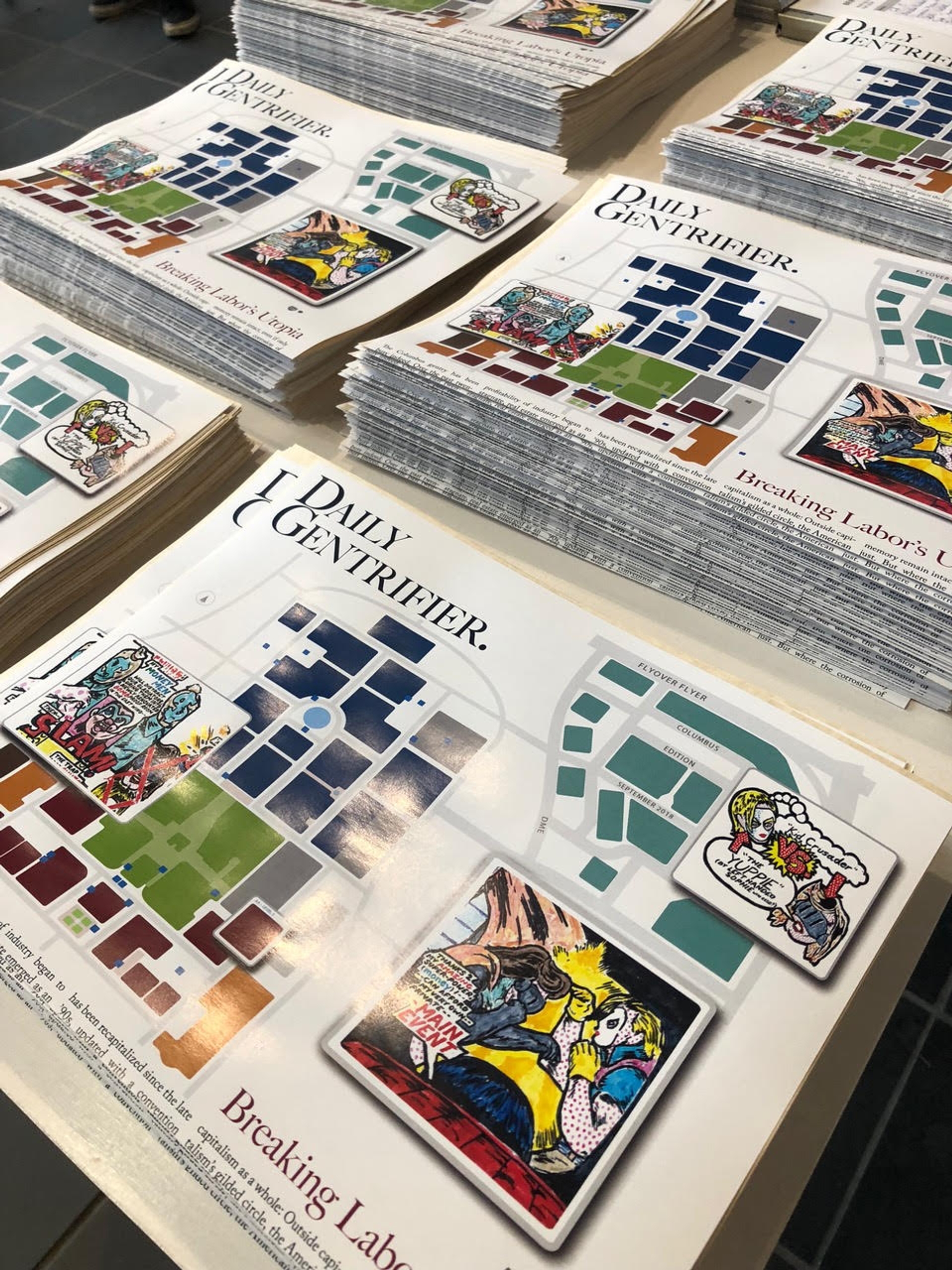
I made the first Daily Gentrifier as a two-sided print – with LA on one side and New York on the other – because I wanted to show how it was “the same but different.” Then I started doing the Daily Gentrifier’s Flyover Flyers when I moved to Chicago because I noticed how gentrification was playing out in medium-sized cities, and I wanted to represent those various particularities but also bring them together to show the patterns.
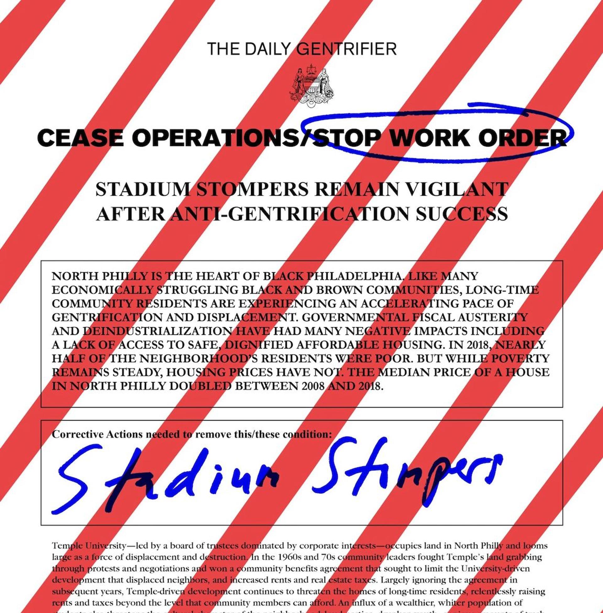
Gentrification fetishizes the local and then slowly eradicates it, so I knew that I wanted to somehow use “the local” as a starting point, to basically reclaim it. And then my particular interest, the only place where I feel like I have any actual leverage, is within the art community, so I wanted to see how each locale’s art communities were responding. Oftentimes, these usually white, usually educated art people are enticed to move into a neighborhood as transitional occupants, to make the neighborhood cool, and then they are later pushed out when higher-earning professionals want in on it. But there are successful methods of resistance, so I’ve made sure to cover the tenant-rights successes of Mariachi Plaza in LA and the Stadium Stompers’ victory against Temple University in Philly, because I don’t want to give the impression that gentrification is completely inevitable and we should just shrug it off.
I’m just starting the Daily Gentrifier’s International Editions, so I’m looking into a few places in Europe and South America, because I am already somewhat familiar with what’s going on there. In a few post-socialist places I’m looking at, such as Lodz in Poland and Tallinn in Estonia, I’m curious about how previously nationalized properties and neighborhoods are being gentrified now. In Lodz, the formerly Jewish areas are still being “developed” decades after the holocaust. And in Tallinn, you have a situation where transplanted Russians, who were part of a minority-but-dominant group during the Soviet era, are being pushed out of attractive real estate by arts organizations, organic markets, and Airbnb-driven tourism. There is always a specific history and specific laws, but the key part is how people respond. That is what interests me most.
Can you discuss how you choose the location focus for each issue? And your approach to the design?
I chose my first few locations for the Flyover Flyers based on giving lectures about the NY/LA edition. Afterwards, people would come up to me and talk about the local situation. I realized this was a self-selecting and motivated audience, and that I could use those talks as a way to gather a staff of sorts and help them publish on their local situation. Each place has some distinct relationship to the problem that is playing out in real time, so once we start talking about that, the focus of the publication becomes pretty clear. My goal is to cover enough of these medium-sized cities to give a picture of how this is playing out across the country, in places that don’t have enough of a local arts press to actually chronicle what is happening. I also get participation from a local arts organization, both because it gives us some funding to pay everyone and because it kind of makes the thing stick better if you do the event in a place that’s caught up in what you’re talking about. So in Columbus, Ohio, Jo-ey Tang – who is the curator of the Beeler Gallery at the Columbus College of Art and Design – invited me to do a talk, and then to put out the publication a year later. In Philadelphia, the Print Center hosted our release party.
With the design, I really wanted to play up the local, so we try to figure out some local flyer genre that feels right. In Columbus, this was pretty tricky because the city doesn’t have a very strong visual identity, so Ry Wharton, the designer, and I decided to embrace that blandness and base the flyer on a mall map. In Philadelphia, Aaron Gemmill was the designer, and he noticed how attractive the city’s Zoning Notices and Stop Work Orders were, so we just decided to insert our content into those templates. I’m working on Nashville now and I want to use wood-type because that’s the big printing tradition there.
“I tell people I teach in the Department of Humor and Distributed Media.”
Do you view this type of work as part of a larger tradition of print satire, pamphleteering, etc? How / what precedents are you looking at?
I don’t exactly think of it as satire, because I don’t exaggerate, but I suppose there is a twist between form and content, which might qualify it. I basically use an existing visual language to address the things that language usually covers up. So in that way the antecedents are things like General Idea’s FILE magazine, the Yes Men’s fake New York Times about the Iraq War ending when it hadn’t, and things like that. I also like the kind of impossible/improbable proposals, like Jeremy Deller’s posters for shows that didn’t happen, as well as various kinds of media-insertion projects, like Adrian Piper’s Mythic Being series and calling cards. Simone Leigh’s Waiting Room Magazine is a touchstone for me, too, in how it points so directly to how bad regular waiting room magazines are. Another big influence for me was Émigré magazine, the famous design magazine, because it started out – and basically failed – as a magazine for émigrés. People ignore the first eight issues, but I find them fascinating precisely because they addressed an impossible demographic. Like, what do you advertise to émigrés in general? Suitcases?
Is print, particularly DIY publishing, a place of potential radical discourse in an age of data surveillance? As in, is it something we can or will soon need to harness so that individuals’ reading habits avoid being tracked online etc.?
Yeah, I think a lot of people already see it that way, especially in activist circles. I personally think VPNs and other digital tools will be more important than print, but I am working on Privacy Magazine to deal with those exact issues. But I can’t comment further, because that project is very hush hush.
Do you view making publications in general as a “practice”? An artistic one? A curatorial one? An editorial practice that is unique as a genre?
At first, I didn’t understand how publishing could be a creative practice because I came into it from a publishing-as-publishing position, collaborating on n+1 and starting Paper Monument, and I was keeping the art separate. But as soon as I realized how it could all be turned inside out, I never went back because publishing gave me a place to do all the things I like to do. It allowed me to put the objects in a lot of different contexts, often without permission from the art world.
One time maybe ten years ago, I was giving a talk at California College for the Arts in the painting department, but when it came time for the studio visits, a social practice student had signed up. I was somewhat nervous about what kind of critique I could give him, but he just quickly explained how my publishing projects could be seen as social practice. I didn’t have any inclination to argue with him. A similar thing happened with a design program. They emailed me, and I was like, “you know that I don’t design design these publications, right?” I don’t even know how to use InDesign. And they were like, “you design them as an idea, so come talk about that.” Again, I wasn’t inclined to argue. Now I run a journalism program, so I can also frame what I do as journalism, but I actually tell people I teach in the Department of Humor and Distributed Media.


